

Why are football clubs shifting to minimalist logos?
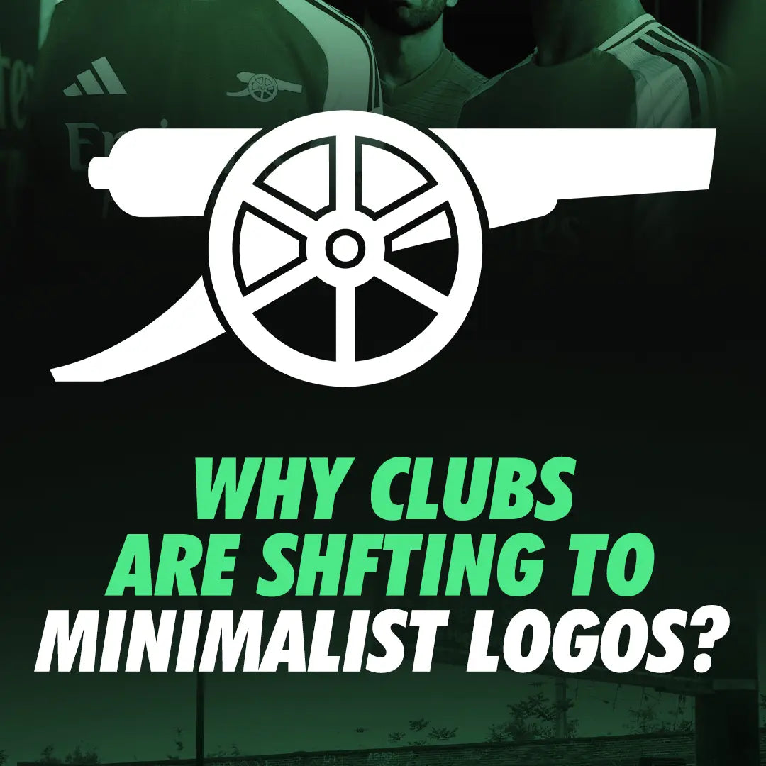
Arsenal fans are torn over the new home kit. The club recently unveiled their home kit for the 2024–25 season, featuring a minimalist cannon instead of the full crest. Some fans are liking it, while others think that the club's logo is meaningless without the wordmark and shield. Gunners have been doing this with their third kits, social media, and digital assets for some time now.
Interestingly, Arsenal is not the first club to do so. Liverpool and Juventus have also done this in the past. But why are football clubs shifting to minimalist logos? While many may think this is because of the latest design trends, the main reason is that football clubs are not just football clubs anymore.
They are lifestyle, fashion, and entertainment brands. Hence, they want to have modern and abstract logos that are easily recognisable, from huge banners to minute mobile screens. Minimalist logos also increase commercial opportunities, as clubs can explore effective branding across smaller merchandise like rings and cufflinks.


Leave a comment